How to Increase Conversions on Shopify
Written by Jamie
If you own or operate a Shopify website you may be in the common position whereby you think your conversion rate should be higher. This is a tricky place to be, and can be extremely difficult to improve – especially when any action you take could have an adverse effect. Luckily, there are some low-hanging fruit in terms of quick-wins you can implement to your Shopify website in hope of increasing your rate. (These tips also apply to other e-commerce websites, with varying implementation specifics.)
Before we move on – your conversion rate (for an e-commerce website such as one on Shopify) is the number of visitors to your website which made a purchase, divided by your total number of visitors. For example, if you have 100 visitors to your website and 1 of them purchases, you have a conversion rate of 1%. Before you decide your conversion rate is too low and you need to implement some Conversion Rate Optimisation (CRO), first of all you should figure out if your conversion rate is actually low.
What Is a Good Conversion Rate?
This is a tough question, and many variables can influence how well your website should be converting. Hard and fast numbers are never great, but many sources say something around 2.5% is about average. However, don’t get hung up on this number. Just a few factors which can greatly influence your conversion rate are:
- What you’re selling. If you’re selling your own products this is totally different to selling someone else’s products.
- How new your website is. Does anyone recognise your brand? Especially important if you’re selling your own products. The longer your website has been going, the more likely customers will recognise you and trust you.
- How you’re driving traffic to the site. If all of your traffic is coming in to blog posts for information gathering then it’s pretty likely those users don’t have an intent to purchase. However if they’re being driven to product pages from targeted, paid advertising then they are much more likely to buy.
- How well optimised your website is. No one is going to buy from a website which is poorly optimised. This is what we’re going to focus on in this article.
If your conversion rate is lower than 2% then generally that means there is huge room for improvement regardless of the above points.
Have You Ever Tried Purchasing From Your Own Website?
You’d be surprised how often we work on websites which have fundamental issues. The first thing you should do is test your own conversion funnel for your most common use-cases, eg. you type in your website URL and land on the home page, and want to proceed to purchase your most popular product. Write down the steps and make specific notes for unnecessary clicks, scrolling, reading, typing, etc. Do this on desktop and mobile. Do it in 2 different web browsers. You may be surprised to find simple bugs and issues stopping you proceeding, such as having to scroll down the product page to find the add to cart button. Get these problems rectified immediately before proceeding.
Divide and Conquer – Focus On Your Most Trafficked Landing Pages
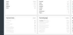
A website can have hundreds of products and pages. Go into your Shopify dashboard (Reoprts, Dashboard) and look at the Top landing pages section. You may be surprised to see that 2 or 3 of your pages account for > 75% of your websites’ traffic. Disregard all other pages and focus on these initially.
Shopify Dashboard
Implement A/B Tests Through Google Analytics Experiments
A/B tests are an age-old way of testing two pages alongside each other. Redesign your key landing pages and mix up the elements to try something new. If your existing pages lead with content, change them to lead with products. If they are image-heavy, change them to focus more on copy. If your customer testimonials are at the bottom, move them to the top. Don’t be shy – change as many elements as you like and save them all as alternative variants (just because the name A/B indicates you’re testing page A and page B doesn’t mean you can’t have more than 2 pages testing at once).
Save all of your alternative pages as new page templates in your Shopify theme and suffix the file names with something so you know which is which (eg. if your original template is “page.landing.liquid”, name your variations “page.landing-2.liquid”, “page.landing-3.liquid”, etc.).
Now go into Shopify page admin and duplicate the original page (unfortunately there’s no shortcut for this in Shopify, so you must create a new page and paste everything across), amend the selected template to choose one of the new ones and change the page handle (in Website SEO section) to something resembling your template file name (eg. “-2” suffix).
Your new page variations should now be available to view. Unfortunately, search engines can see them too, and you don’t want to get penalised for having duplicate (or very similar) pages. To make sure these new pages aren’t indexed you’ll need to edit your Shopify theme to include a META tag to “noindex” the pages. This change should be made in the HEAD, which is usually in theme.liquid.
{% if template == 'page.landing-2' or template == 'page.landing-3' %}
  <meta name="robots" content="noindex">
{% endif %}
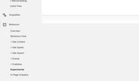
Once that’s sorted you need to move into Google Analytics and create your experiment.
Google Analytics Experiments is within the Behaviour section
Eventually you’ll be given a code snippet which you need to include in your Shopify theme. Again you’ll have to edit your theme.liquid file and use a similar IF statement to target your appropriate templates, this time separately (as the code differs between the page variations).
{% if template == 'page.landing-2' %}
  <!-- Google Analytics Content Experiment code -->
  <script>function utmx_section(){}function utmx(){}(function(){var
  k='xxxxxxxx-x',d=document,l=d.location,c=d.cookie;
  if(l.search.indexOf('utm_expid='+k)>0)return;
  function f(n){if(c){var i=c.indexOf(n+'=');if(i>-1){var j=c.
  indexOf(';',i);return escape(c.substring(i+n.length+1,j<0?c.
  length:j))}}}var x=f('__utmx'),xx=f('__utmxx'),h=l.hash;d.write(
  '<sc'+'ript src="'+'http'+(l.protocol=='https:'?'s://ssl':
  '://www')+'.google-analytics.com/ga_exp.js?'+'utmxkey='+k+
  '&utmx='+(x?x:'')+'&utmxx='+(xx?xx:'')+'&utmxtime='+new Date().
  valueOf()+(h?'&utmxhash='+escape(h.substr(1)):'')+
  '" type="text/javascript" charset="utf-8"><\/sc'+'ript>')})();
  </script><script>utmx('url','A/B');</script>
  <!-- End of Google Analytics Content Experiment code -->
{% endif %}
Google Analytics will now verify everything is set up correctly and begin the experiment. Now you can forget about it and come back when your selected time period/traffic quota has elapsed to see the winner! You should be able to make your own conclusions regarding element placement depending on which pages perform best.
Product Placement On Your Shopify Landing Pages
Potential customers will find it hard to purchase if the product placement on your landing pages is not optimised. All of your top landing pages should feature products with an add to cart CTA above the fold for easy access. Create a small shop-window element in your Shopify theme and save it as a snippet. Then include it into your landing page templates where necessary. If the product placement is not 100% relevant to the page content then this is best included in a sidebar element.
Invest In High-quality Professional Photography
Customers are fickle. If your product imagery has been taken in your living room customers will notice. Getting a professional photographer can be expensive but will certainly be worth it.
Which would you rather purchase?
Make sure the same models are used throughout, a green screen (or white background) is behind the subject and that all photos are consistent. A good photographer should take care of all this on your behalf. Also make sure you are supplied with all assets in full resolution, with RAW images if available.
Improve Page Load Times
There has been a lot of research published about this recently. Kissmetrics report that a 1 second delay in page load will result in a 7% reduction in conversions. This is pretty horrifying, more so if your website has a high-turnover.
If your website has this PageSpeed Insights score you need to rectify it now!
On the flip-side, improving your page load time can be very easy achieved. Google provide a tool which can be used to check your website and highlight areas for improvement, this is a great starting point for spotting quick wins. We also highlight Google’s score in our own Free SEO Analysis Report tool as we deem it so important (plus Google factors in page load times in their ranking algorithm). More often than not, huge improvements can be made just by optimising images – use a tool like TinyJPG to easily rectify this.
Offer As Many Checkout Options As Possible
As we’ve touched on previously, Stripe is our preferred payment gateway to integrate into e-commerce websites. However from a consumer’s point-of-view, the more checkout options available, the better (be careful not to overwhelm the user with options in your interface though – have a clear, recommended, primary method).
Multiple options benefit users who may have accounts elsewhere. For example, if the user has an existing account with Amazon or PayPal then they can utilise either of those payment options without re-entering payment details on your website – often checking out with a single click. This can be the difference between making or losing a sale on a cumbersome mobile device.
Shopify payment options
PayPal, Amazon and Stripe are really easy to integrate into your Shopify website. Simply go to the Shopify admin Payments settings and follow the steps.
Publish Regular Content Which Asserts Your Authority
Having a regularly updated blog or news page on your website is key not only for SEO reasons, but also to show your customers that you are an expert in the products that you are selling. For example if you’re about to buy a health food product from a brand you’ve not heard of, it can be very useful if you can see articles written by the seller proving the quality of the product. Whether that’s a recipe, a recently-won award or a 3rd-party testimonial, any supporting content like that will certainly nudge the customer towards trusting your brand.
Highlight Products With Discounts
A sales tactic which has been around forever but is still relevant in the digital age – sales and discounts. Giving customers belief that they’re getting good value is key t o making a sale. There are plenty of ways to achieve this online – whether it’s promotional codes, “today only” sales, or just simply striking out one price and showing another, all of them work and should be utilised in some form.
This notebook is supposed to be £9.99 but I’m getting it for £9.17!
It’s easy to set up discounts and sales in Shopify too – simply go into the products admin and fill in the Compare at price field.
Conclusions
So there you have it. Plenty of easy to implement ideas for improving conversion rate on your Shopify website. Hopefully you can pick a few of these up, integrate them and see the results!


