Paired for perfection – Bowmore x Aston Martin
The brief
Next up in our partnership with Red Border by TIME, we’re showcasing an iconic partnership through an interactive online piece.

The challenges
Showcasing classic, heritage brands digitally needs consideration. Interactive often means gimmicky and over-the-top, miles from the simple design associated with Bowmore and Aston Martin.
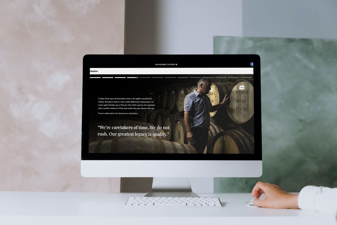
This brief, therefore, focused on the stunning imagery and editorial style favoured by the two brands, lending itself to a click-to-advance story. This format allowed us to showcase full screen, breathtaking photography and overlaid text with subtle animation. The tap-to-advance functionality allowed users to scroll through the content and follow the story.


Flaunt's strategy
Thanks to social media, tap-to-advance is becoming an increasingly popular content format. It allows users to either navigate at their own pace or sit back and watch the story play out, reflecting the content sentiment – ‘the value of time’. The full-page imagery gives a distraction-free setting, and by overlaying short pieces of text, the experience is more engaging for audiences who aren’t faced with a wall of a copy.
The end result is a slick, engaging user experience reflective of the editorial style favoured by these brands and complements the TIME website design and user experience.


