simple and to the point
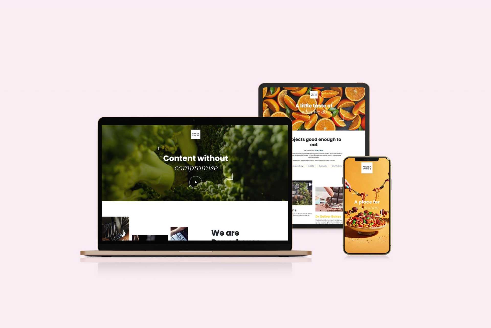
Powerhouse’s existing website was uninspiring and didn’t reflect their strong brand and impressive work. The site had been built on Squarespace, and after an initial review stage, it was clear that Powerhouse needed migrating to a more powerful platform such as WordPress.
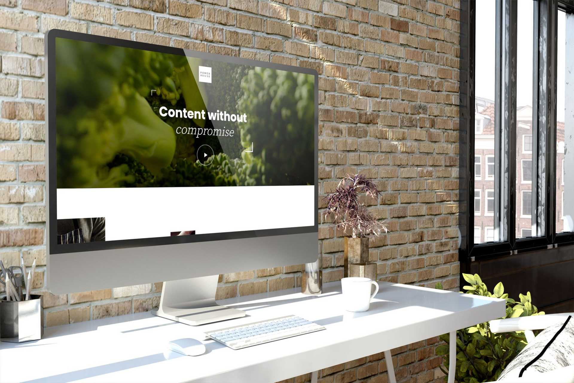
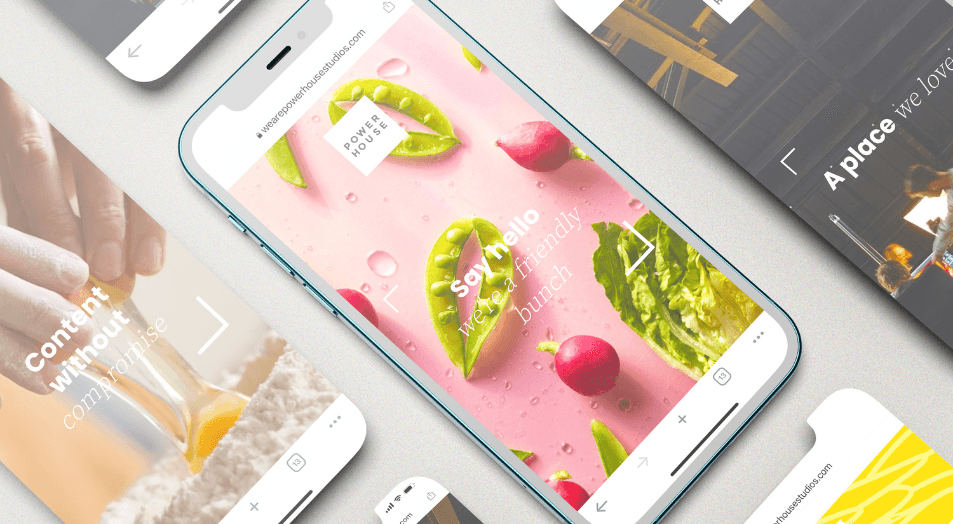
The brief was simple and to the point. Mobile-first, responsive, visually-led, fast, unique. Lead generation was always the end game, so optimised button placement and engaging messaging were highly prioritised.
With a huge library of visual content from videos to photography, this site gave us a chance to show off what Powerhouse do best, and create an engaging site with subtle animation, video and bold design.
